Evaluating LCZ-based Interpolation in Berlin
Max Anjos
October 25, 2025
Source:vignettes/local_func_modeling_eval.Rmd
local_func_modeling_eval.RmdIntroduction
Quantifying interpolated air temperature is crucial for climate
research, especially when the results are used for various applications.
The LCZ4r package provides the lcz_interp_eval() function
to assess LCZ-based interpolation. In this tutorial, we’ll demonstrate
how to use this function to evaluate air temperature interpolation
across Berlin, Germany. We’ll calculate and visualize evaluation
metrics.
Load package
if (!require("pacman")) install.packages("pacman")
pacman::p_load(dplyr, sf, tmap, ggplot2, ggExtra, ggpmisc)

library(LCZ4r) # For LCZ and UHI analysis
library(dplyr)  # For data manipulation
library(sf)         # For vector data manipulation
library(tmap)       # For interactive map visualization
library(ggplot2) #For data visualization
library(ggExtra) # For marginal histograms
library(ggpmisc) # For regression equation and R2
Dataset
# Get the LCZ map for Berlin using the LCZ Generator Platform
lcz_map <- lcz_get_map_generator(ID = "8576bde60bfe774e335190f2e8fdd125dd9f4299")

# Optional: Clip the LCZ map to the Berlin area
lcz_map <- lcz_get_map2(lcz_map, city = "Berlin")

# Visualize the LCZ map
lcz_plot_map(lcz_map)
Load sample Berlin data
# Load sample Berlin data from the LCZ4r package
data("lcz_data")
view(lcz_data)
Demo: interpolate map for a specific hour of day
# Map air temperatures for January 2, 2020, at 04:00
my_interp_map <- lcz_interp_map(
  lcz_map,
  data_frame = lcz_data,
  var = "airT",
  station_id = "station",
  sp.res = 100,
  tp.res = "hour",
  year = 2020, month = 1, day = 2, hour = 4
)

# Customize the plot with titles and labels
lcz_plot_interp(
  my_interp_map,
  title = "Thermal field",
  subtitle = "Berlin - January 2, 2020, at 04:00",
  caption = "Source:LCZ4r, 2024.",
  fill = "[ºC]"
)
Wow! That’s great. We can see a well-defined urban heat island in central areas.
Evaluate a spatial and temporal interpolation
The key question is: How confident is the interpolated map? To address this, we use the lcz_interp_eval() function to quantify the related error, which is crucial for understanding how well the LCZ-based interpolation predicts air temperatures.
key fatures of lcz_interp_eval()
This function evaluates the variability of spatial and temporal interpolation of a variable (e.g., air temperature) using LCZ as a background. It supports both LCZ-based and conventional interpolation methods. The function allows for flexible time period selection, cross-validation, and station splitting for training and testing.
In this demo, we select hourly air temperature data for January 2020 at a 500-meter spatial resolution, using:
- extract.method: simple (assigns the LCZ class based on the value of the raster cell in which the point falls).
- LOOCV: TRUE (leave-one-out cross-validation for evaluation).
- vg.model: Sph (spherical variogram model for kriging)
- LCZinterp: TRUE (activates interpolation with LCZ).
Note: This process may take a while, but don’t worry—grab a cup of coffee!
# Evaluate the interpolation
df_eval <- lcz_interp_eval(
  lcz_map,
  data_frame = lcz_data,
  var = "airT",
  station_id = "station",
  year = 2020,
  month = 1,
  LOOCV = TRUE,
  extract.method = "simple",
  sp.res = 500,
  tp.res = "hour",
  vg.model = "Sph",
  LCZinterp = TRUE
)
Check the results out!
Let’s examine the structure of the output data frame. The function returns a data frame with date, station, lcz, observed values, predicted values, and residuals (the difference between observed and predicted values). If isave = TRUE, a shapefile with additional information will also be saved to your computer.
str(df_eval)
Analyse the outcomes with metrics
Based on the table results, we calculate evaluation metrics to quantify uncertainties. Key metrics include: root mean square error (RMSE), mean absolute error (MAE), and symmetric mean absolute percent error (sMAPE), chosen to address MAPE’s sensitivity to near-zero values.
Note that, we aggregated the metric values by LCZ class
#Calculate metrics
df_eval_metrics <- df_eval %>%
  group_by(lcz) %>%
  summarise(
    rmse = sqrt(mean((observed - predicted)^2)), # RMSE
    mae = mean(abs(observed - predicted)),      # MAE
    smape = mean(2 * abs(observed - predicted) / (abs(observed) + abs(predicted)) * 100) # sMAPE
  )

df_eval_metrics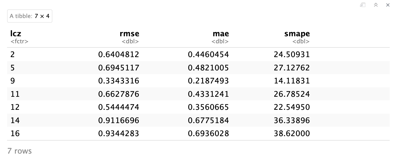
Correlation between observed and prediced values
# Correlation plot with regression equation and R2
p1 <- ggplot(df_eval, aes(x = observed, y = predicted)) +
  geom_point(alpha = 0.5, color = "blue") + # Scatter points
  geom_smooth(method = "lm", color = "red", se = FALSE) + # Regression line
  stat_density2d(aes(fill = ..level..), geom = "polygon", alpha = 0.3) + # Density contours
  scale_fill_viridis_c() + # Viridis color scale for density
  stat_poly_eq(
    aes(label = paste(..eq.label.., ..rr.label.., sep = "~~~")),
    formula = y ~ x,
    parse = TRUE,
    label.x.npc = "left", # Position of the equation
    label.y.npc = "top"
  ) + # Add regression equation and R2
  labs(
    title = "",
    x = "Observed values",
    y = "Predicted values"
  ) +
  theme_minimal(base_size = 14) # Minimal theme for elegance

# Add marginal histograms
p1_with_marginals <- ggExtra::ggMarginal(p1, type = "histogram", fill = "gray", bins = 30)

# Print the plot
p1_with_marginals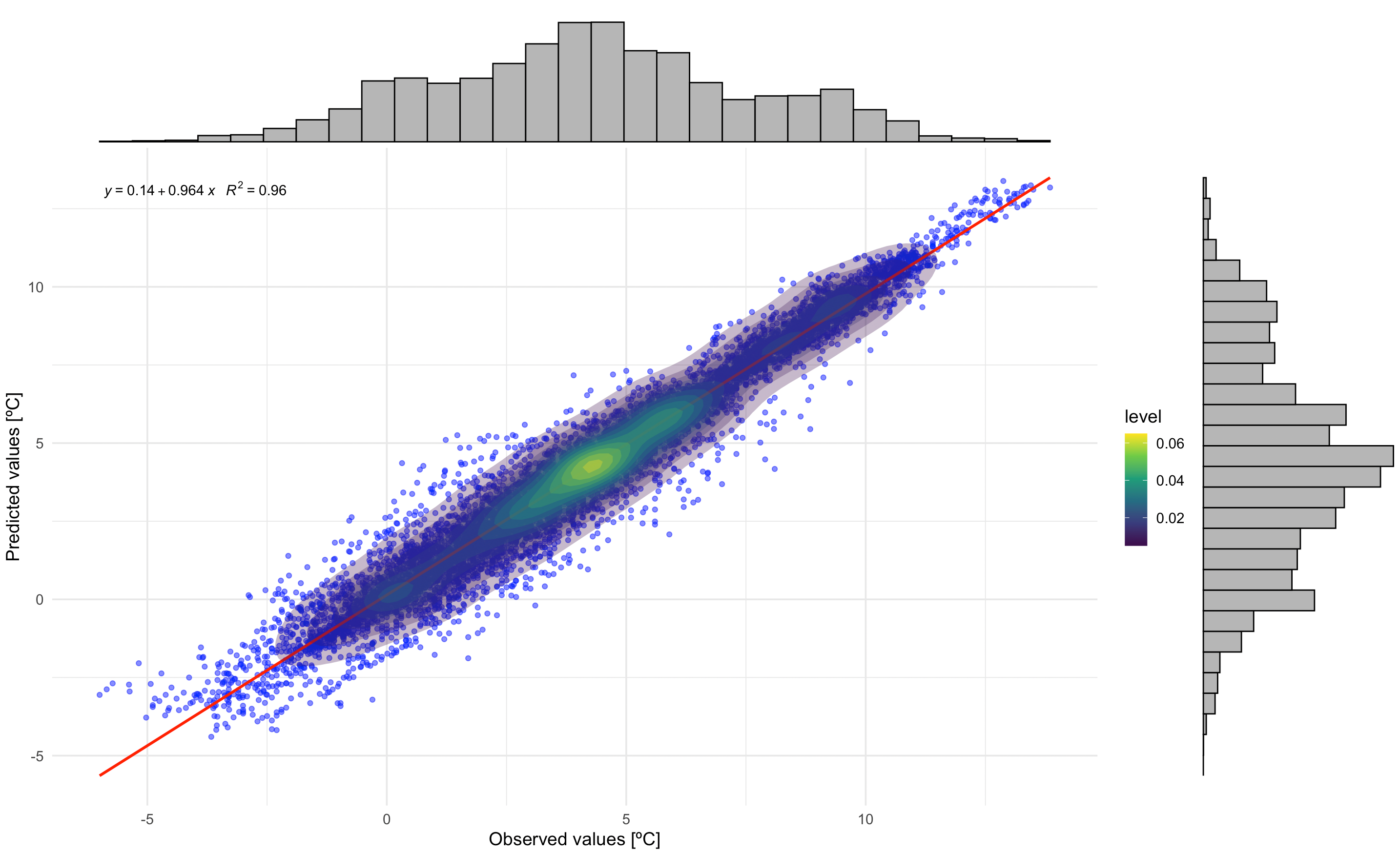
Residuals
In this plot, you can see the residuals by LCZ. The plot displays residuals vs. observed values for each LCZ in separate facets. It includes a scatterplot, a horizontal reference line (red), a loess smoothing line (blue), and density contours.
# Residuals plot by LCZ
p2 <- ggplot(df_eval, aes(x = observed, y = residual)) +
  # Scatter points with transparency for better visibility
  geom_point(alpha = 0.4, color = "darkgreen", size = 1) +
  # Horizontal reference line at 0
  geom_hline(yintercept = 0, linetype = "dashed", color = "red", size = 0.8) +
  # Loess smoothing line for trend
  geom_smooth(method = "loess", color = "blue", se = FALSE, size = 1) +
  #Density contours for point concentration
  stat_density2d(aes(fill = ..level..), geom = "polygon", alpha = 0.4) +
  scale_fill_viridis_c(option = "D", direction = -1) + # Viridis color scale
  # Facet by LCZ with free scales
  facet_wrap(~ lcz, scales = "free", ncol = 3) +
  # Labels and titles
  labs(
    title = "",
    x = "Observed values",
    y = "Residuals",
    fill = "Density"
  ) +

  # Customize
  theme_minimal(base_size = 14) +
  theme(
    plot.title = element_text(size = 16, face = "bold", hjust = 0.5), # Centered bold title
    axis.title = element_text(size = 14, face = "bold"), # Bold axis titles
    axis.text = element_text(size = 12), # Axis text size
    strip.text = element_text(size = 12, face = "bold"), # Facet labels
    legend.position = "right", # Place legend on the right
    legend.title = element_text(size = 12, face = "bold"), # Bold legend title
    legend.text = element_text(size = 10), # Legend text size
    panel.grid.major = element_line(color = "gray90", linetype = "dotted"), # Subtle gridlines
    panel.grid.minor = element_blank()
  )

# Print the plot
p2