Thermal Anomalies
Max Anjos
April 24, 2026
Source:vignettes/local_func_anomaly.Rmd
local_func_anomaly.RmdGetting Started
The thermal anomaly is a great way to evaluate the intra-urban air temperature differences. At each LCZ station, the thermal anomaly is defined as the difference between its temperature and the overall mean temperature of all LCZ stations. For instance, a positive temperature anomaly indicates that a particular LCZ is warmer compared to all other LCZs.
The lcz_anomaly() function has the same utilities as the
lcz_ts() regarding flexibility of time
selection and splitting LCZ time series by temporal
window or site.
library(LCZ4r)

# Get the LCZ map for your city
lcz_map <- lcz_get_map_euro(city = "Berlin")

# Load sample data from LCZ4r
data("lcz_data")
Understanding Thermal Anomalies:
- Positive anomaly (red/warm colors): Station is warmer than the urban average
- Negative anomaly (blue/cool colors): Station is cooler than the urban average
- Zero anomaly: Station temperature equals the urban mean
This metric helps identify urban heat islands and cool spots within the city.
Plotting Options with plot_type
The plot_type argument in lcz_anomaly()
offers several visualizations:
- “diverging_bar”: A horizontal bar plot that diverges from the center (zero), with positive anomalies extending to the right and negative anomalies to the left
- “bar”: A bar plot showing the magnitude of the anomaly for each station, colored by whether the anomaly is positive or negative
- “dot”: A dot plot that displays both the mean temperature values and the reference values, with lines connecting them
- “lollipop”: A lollipop plot where each “stick” represents an anomaly value and the dots at the top represent the size of the anomaly
Below are examples using each plot type.
1. Diverging Bar Plot
# Thermal anomalies for February 6, 2019 at 05:00h
lcz_anomaly(lcz_map,
            data_frame = lcz_data,
            var = "airT",
            station_id = "station",
            time.freq = "hour",
            year = 2019, month = 2, day = 6, hour = 5,
            plot_type = "diverging_bar",
            ylab = "Air temperature [°C]",
            xlab = "Stations",
            title = "LCZ Thermal Anomalies",
            caption = "Source: LCZ4r, 2024")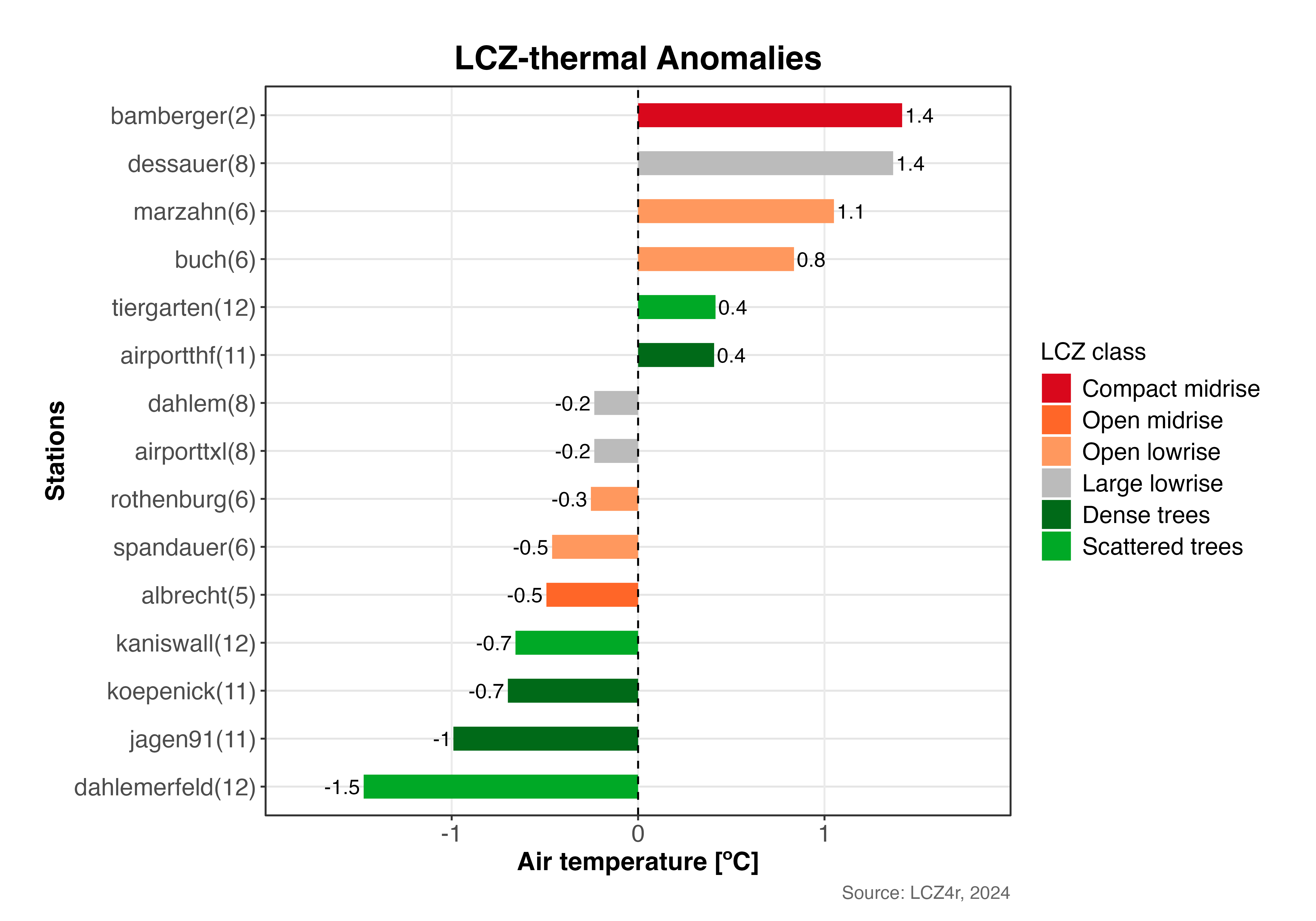
Diverging bar plot showing thermal anomalies across LCZ stations in Berlin (February 6, 2019, 05:00h). Positive anomalies (red) indicate warmer stations, negative anomalies (blue) indicate cooler stations.
2. Bar Plot
# Bar plot for February 6, 2019 at 05:00h
lcz_anomaly(lcz_map,
            data_frame = lcz_data,
            var = "airT",
            station_id = "station",
            time.freq = "hour",
            year = 2019, month = 2, day = 6, hour = 5,
            plot_type = "bar")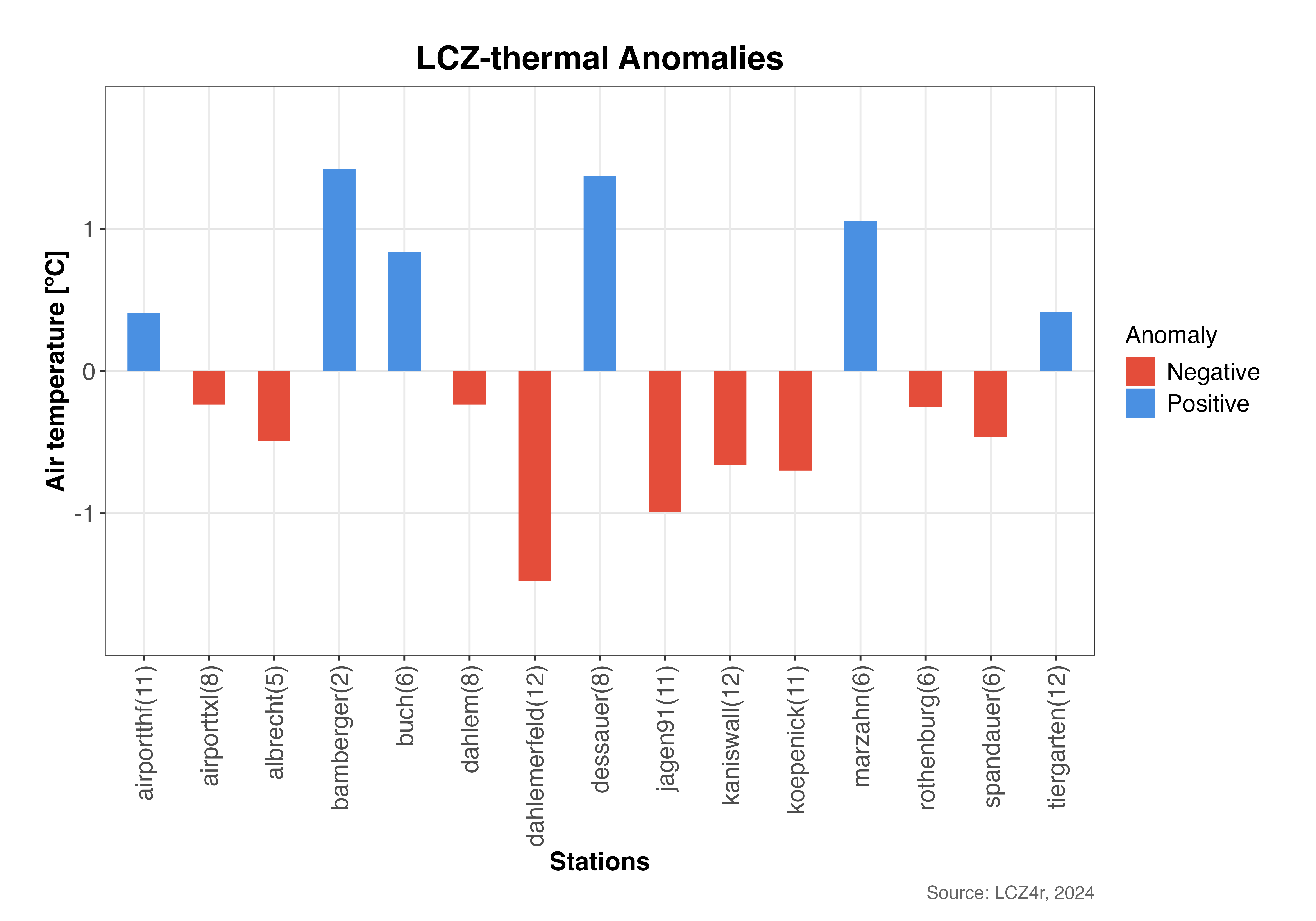
Bar plot showing the magnitude of thermal anomalies for each station. Bars extending above zero indicate positive anomalies (warmer), below zero indicate negative anomalies (cooler).
3. Dot Plot
# Dot plot for February 6, 2019 at 05:00h
lcz_anomaly(lcz_map,
            data_frame = lcz_data,
            var = "airT",
            station_id = "station",
            time.freq = "hour",
            year = 2019, month = 2, day = 6, hour = 5,
            plot_type = "dot")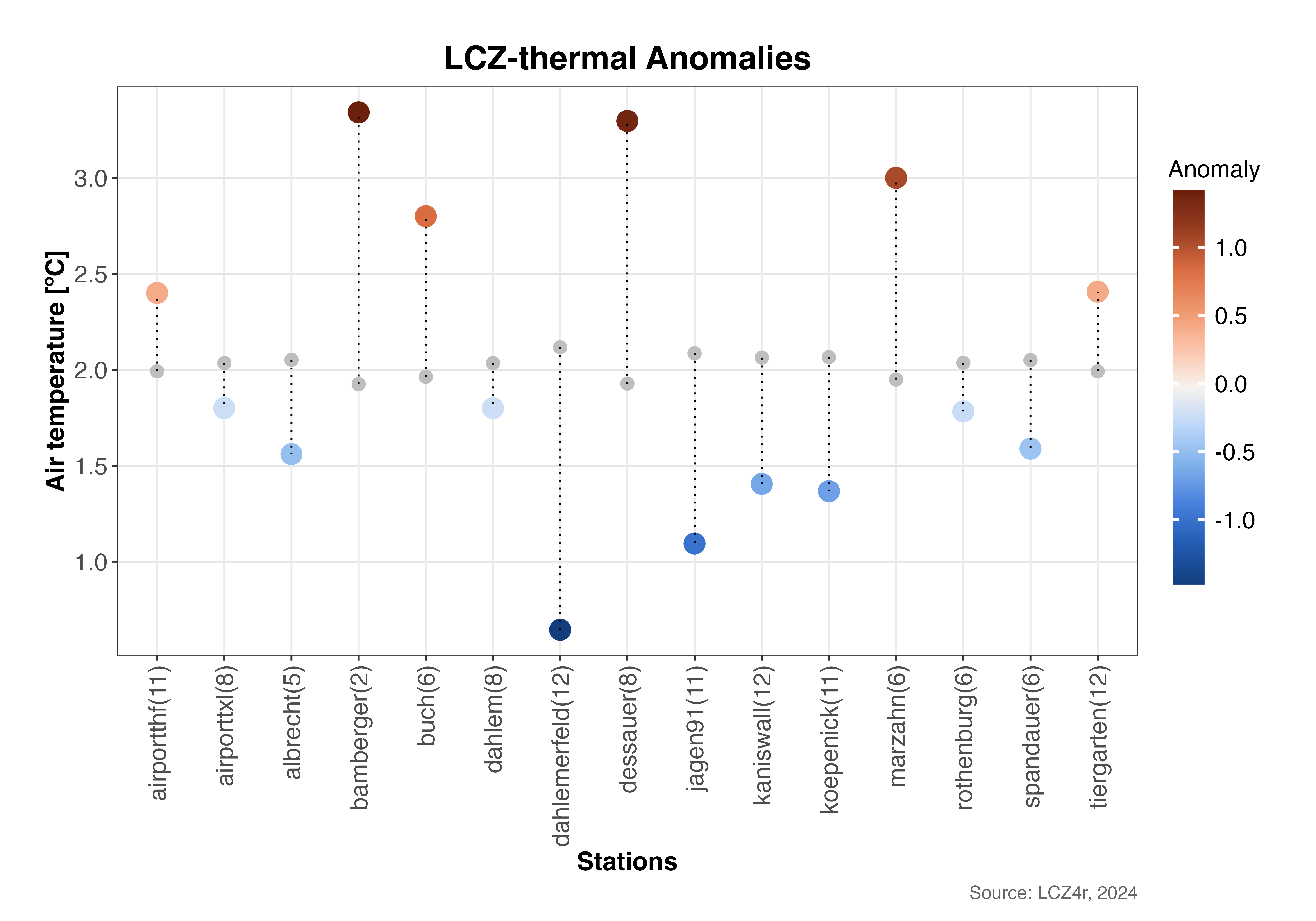
Dot plot showing individual station temperatures (colored dots) compared to the urban average (vertical dashed line). The distance from the line represents the thermal anomaly magnitude.
4. Lollipop Plot
# Lollipop plot for February 6, 2019 at 05:00h
lcz_anomaly(lcz_map,
            data_frame = lcz_data,
            var = "airT",
            station_id = "station",
            time.freq = "hour",
            year = 2019, month = 2, day = 6, hour = 5,
            plot_type = "lollipop")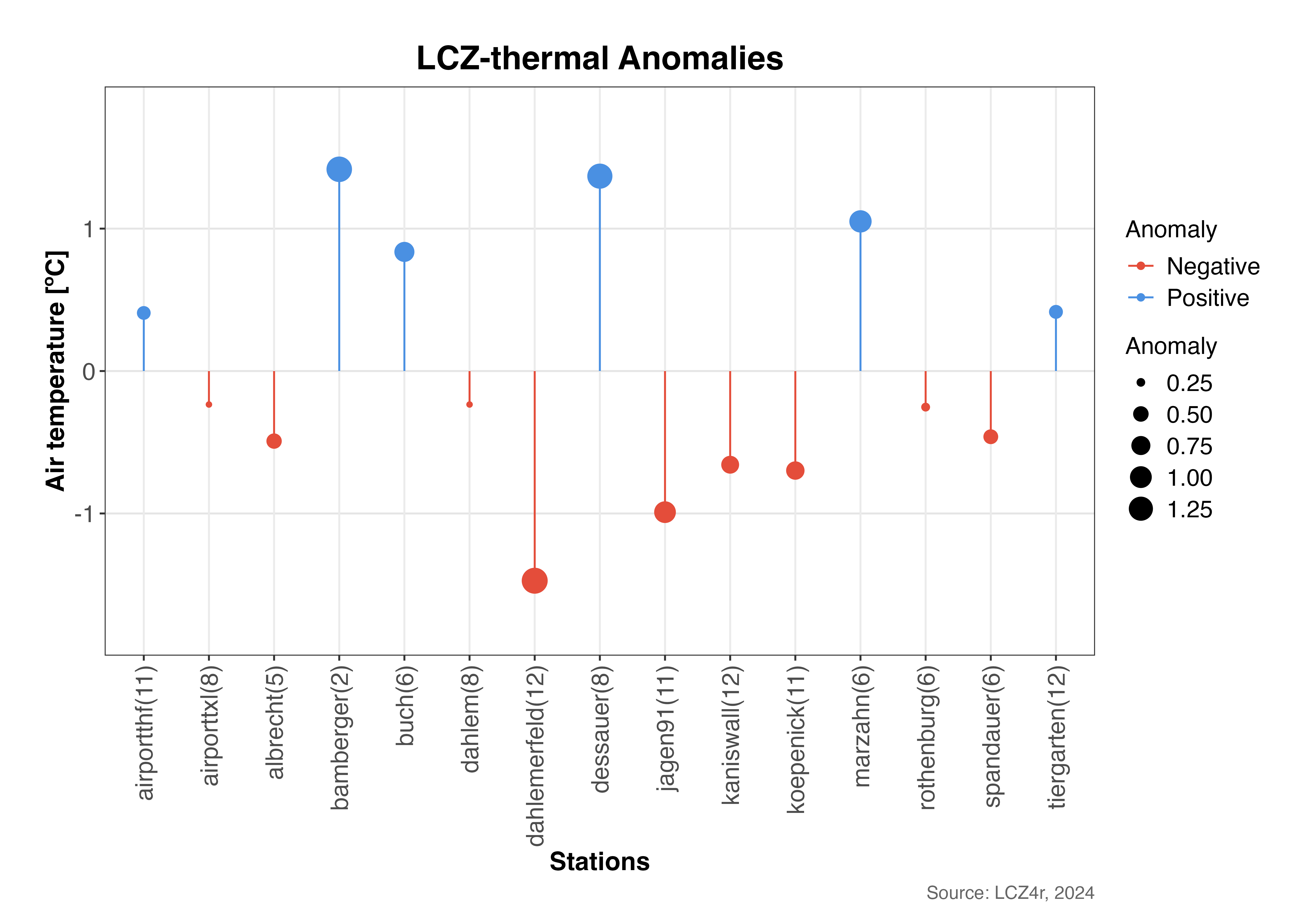
Lollipop plot emphasizing the magnitude and direction of thermal anomalies. The length of each “stick” represents the anomaly value, with dot size indicating the magnitude.
Splitting Anomalies with the “by” Argument
Daylight vs. Nighttime Comparison
# Calculate anomalies for nighttime and daytime on February 6, 2019
lcz_anomaly(lcz_map,
            data_frame = lcz_data,
            var = "airT",
            station_id = "station",
            time.freq = "hour",
            year = 2019, month = 2, day = 6,
            plot_type = "diverging_bar",
            by = "daylight")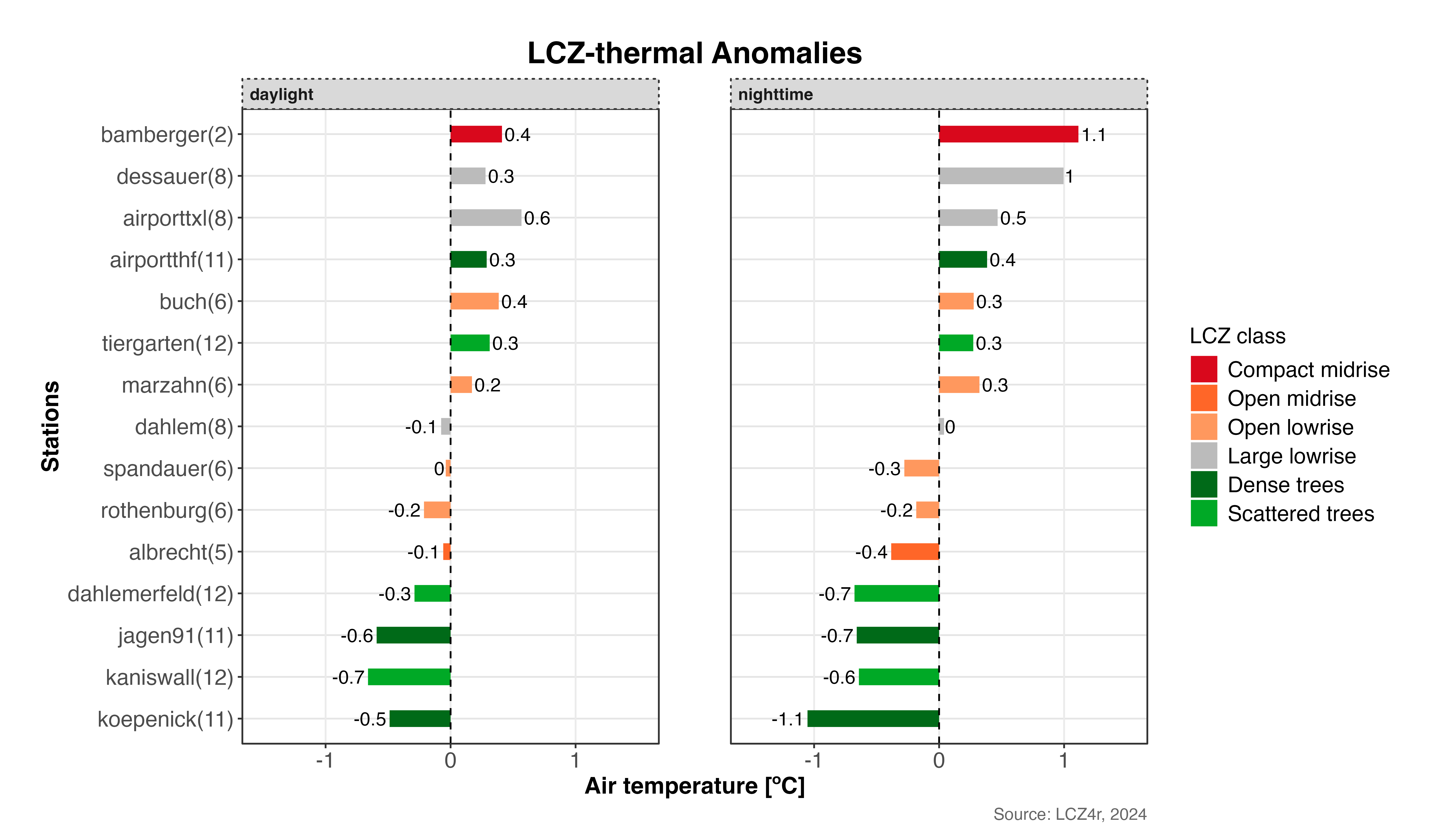
Comparison of thermal anomalies between daytime and nighttime on February 6, 2019. This reveals how urban thermal patterns vary between diurnal periods.
Combining Daylight with Months
# Calculate monthly mean anomalies for February and August 2019
lcz_anomaly(lcz_map,
            data_frame = lcz_data,
            var = "airT",
            station_id = "station",
            time.freq = "hour",
            year = 2019, month = c(2, 8),
            plot_type = "bar",
            by = c("daylight", "month"))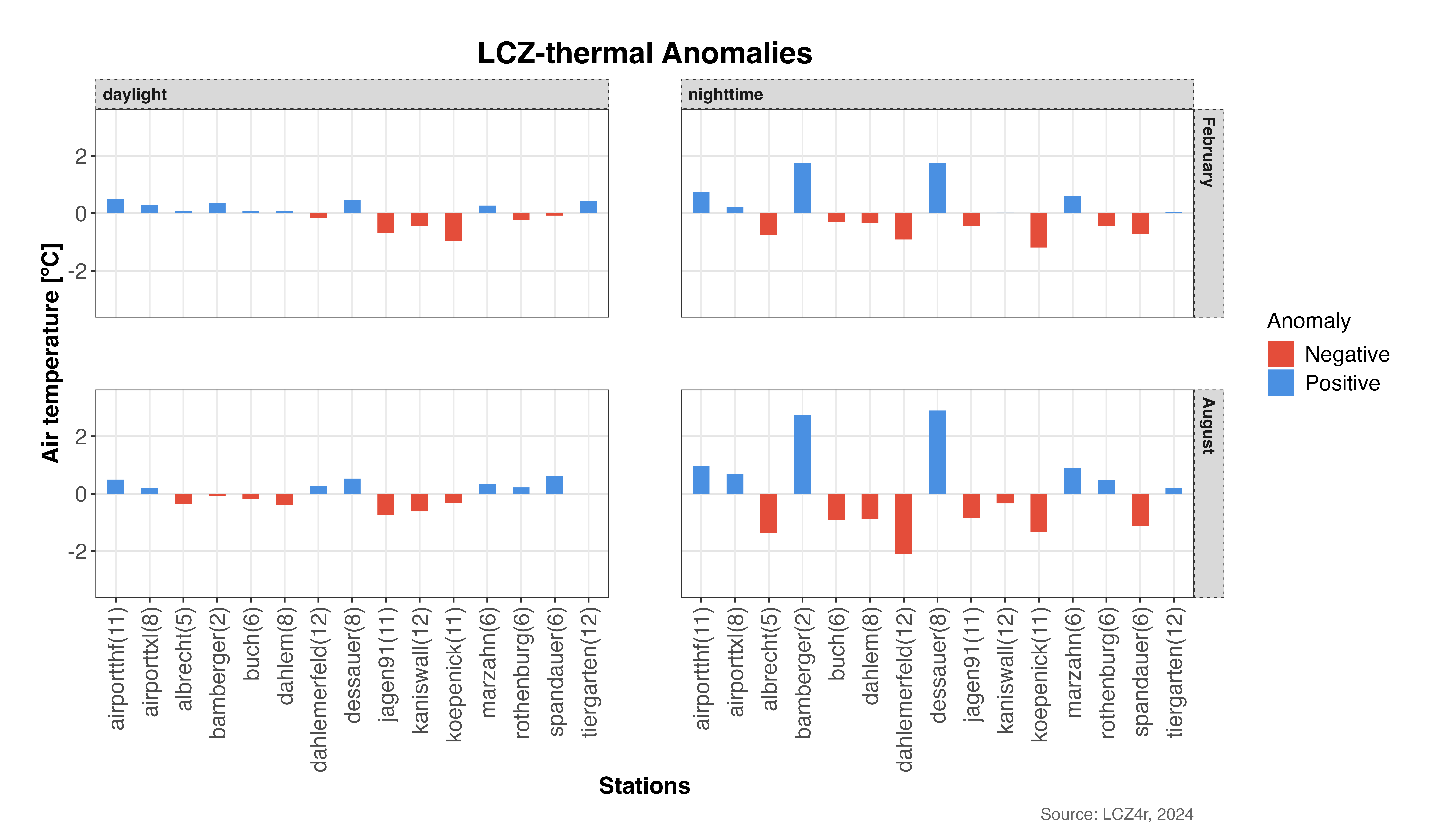
Seasonal and diurnal patterns of thermal anomalies: comparing winter (February) and summer (August) across daytime and nighttime periods.
Advanced Analysis Options
Temporal Aggregation
You can aggregate anomalies at different temporal frequencies:
# Calculate daily mean anomalies for February 2019
daily_anomalies <- lcz_anomaly(lcz_map,
                               data_frame = lcz_data,
                               var = "airT",
                               station_id = "station",
                               time.freq = "day",
                               year = 2019, month = 2,
                               plot_type = "bar",
                               iplot = FALSE)

# Calculate monthly mean anomalies for 2019
monthly_anomalies <- lcz_anomaly(lcz_map,
                                 data_frame = lcz_data,
                                 var = "airT",
                                 station_id = "station",
                                 time.freq = "month",
                                 year = 2019,
                                 plot_type = "bar",
                                 iplot = FALSE)
Customizing Visual Appearance
# Customized diverging bar plot with specific colors and labels
lcz_anomaly(lcz_map,
            data_frame = lcz_data,
            var = "airT",
            station_id = "station",
            time.freq = "hour",
            year = 2019, month = 7, day = 15, hour = 14,  # Summer afternoon
            plot_type = "diverging_bar",
            ylab = "Temperature Anomaly [°C]",
            xlab = "LCZ Classes",
            title = "Summer Afternoon Thermal Anomalies",
            subtitle = "July 15, 2019 - 14:00h",
            caption = "Source: LCZ4r, 2024")
Return a Dataframe as Result
To save the result in R, set iplot = FALSE and create an
object.
# Return dataframe with thermal anomalies for February and August 2019
my_output <- lcz_anomaly(lcz_map,
                         data_frame = lcz_data,
                         var = "airT",
                         station_id = "station",
                         time.freq = "hour",
                         year = 2019, month = c(2, 8),
                         plot_type = "bar",
                         by = c("daylight", "month"),
                         iplot = FALSE)

# View the structure of the returned dataframe
str(my_output)

# View first few rows
head(my_output)
Save Plots
To save a plot to your computer, set isave = TRUE and
specify the file type with save_extension (e.g., “png”,
“jpeg”, “svg”, “pdf”).
# Save thermal anomalies plot to PC
lcz_anomaly(lcz_map,
            data_frame = lcz_data,
            var = "airT",
            station_id = "station",
            time.freq = "hour",
            year = 2019, month = 7, day = 15, hour = 14,
            plot_type = "diverging_bar",
            by = "daylight",
            isave = TRUE,
save_extension = "png")Tip: Saved plots will be automatically organized in
the LCZ4r_output folder with timestamped filenames for easy
reference. The folder is created in your current working directory.
Summary of Parameters
Here’s a quick reference for the main parameters used in
lcz_anomaly():
| Parameter | Description | Options |
|---|---|---|
time.freq |
Temporal aggregation frequency | “hour”, “day”, “month”, “year” |
plot_type |
Visualization type | “diverging_bar”, “bar”, “dot”, “lollipop” |
by |
Data splitting method | “daylight”, “month”, “season”, “weekday”, etc. |
isave |
Save output to PC | TRUE/FALSE |
iplot |
Display plot | TRUE/FALSE |
var |
Variable to analyze | Column name with temperature data |
station_id |
Station identifier column | Column name with station IDs |
Interpreting Thermal Anomalies
Understanding the patterns in thermal anomalies can provide valuable insights:
- Compact built LCZs typically show positive anomalies during daytime
- Open low-rise LCZs often exhibit negative anomalies due to better ventilation
- Industrial areas frequently display strong positive anomalies
- Vegetated LCZs generally show negative anomalies, especially during daytime
- Water bodies can create cool islands with persistent negative anomalies
Application Example: Urban planners can use thermal anomaly maps to identify heat-vulnerable areas and prioritize interventions such as green infrastructure or cool materials in locations with persistent positive anomalies.
Have feedback or suggestions?
Do you have an idea for improvement or did you spot a mistake? We’d love to hear from you! Click the button below to create a new issue (GitHub) and share your feedback or suggestions directly with us.
Open GitHub issue