Evaluating LCZ-based Interpolation in Berlin
Max Anjos
April 24, 2026
Source:vignettes/local_func_modeling_eval.Rmd
local_func_modeling_eval.RmdIntroduction
Quantifying interpolated air temperature is crucial for climate
research, especially when the results are used for various applications
such as urban planning, heatwave early warning systems, and public
health assessments. The LCZ4r package provides the
lcz_interp_eval() function to assess LCZ-based
interpolation accuracy and reliability.
In this tutorial, we’ll demonstrate how to use this function to evaluate air temperature interpolation across Berlin, Germany. We’ll cover:
- LCZ map preparation for Berlin
- Spatial interpolation of air temperature
- Cross-validation using leave-one-out methods
- Evaluation metrics calculation (RMSE, MAE, sMAPE)
- Visualization of model performance by LCZ class
# Load required packages
if (!require("pacman")) install.packages("pacman")
pacman::p_load(dplyr, sf, tmap, ggplot2, ggExtra, ggpmisc)

library(LCZ4r)   # For LCZ and UHI analysis
library(dplyr)   # For data manipulation
library(sf)      # For vector data manipulation
library(tmap)    # For interactive map visualization
library(ggplot2) # For data visualization
library(ggExtra) # For marginal histograms
library(ggpmisc) # For regression equation and R²
Why Evaluate Interpolation?
Spatial interpolation of air temperature is subject to various uncertainties: - Station network density and distribution - Spatial variability of temperature - Model assumptions and parameters - Temporal dynamics of urban climate
The lcz_interp_eval() function helps quantify these
uncertainties, providing confidence metrics for your spatial temperature
estimates.
Dataset Preparation
Load LCZ Map for Berlin
# Get the LCZ map for Berlin using the LCZ Generator Platform
lcz_map <- lcz_get_map_generator(ID = "8576bde60bfe774e335190f2e8fdd125dd9f4299")

# Optional: Clip the LCZ map to the Berlin area for better focus
lcz_map <- lcz_get_map2(lcz_map, city = "Berlin")

# Visualize the LCZ map
lcz_plot_map(lcz_map)
LCZ map of Berlin showing the spatial distribution of Local Climate Zones across the city. This map serves as the spatial framework for temperature interpolation.
Load Sample Berlin Data
# Load sample Berlin meteorological data from the LCZ4r package
data("lcz_data")

# View the structure of the dataset
head(lcz_data)
Structure of the Berlin meteorological dataset showing date, temperature, station ID, and geographic coordinates.
Visualize Monitoring Stations
# Convert the data to an sf object for spatial visualization
shp_stations <- lcz_data %>%
  distinct(Longitude, Latitude, .keep_all = TRUE) %>%
  st_as_sf(coords = c("Longitude", "Latitude"), crs = 4326)

# Visualize the stations on an interactive map
tmap_mode("view")
qtm(shp_stations, text = "station",
    dots.col = "LCZ",
    dots.size = 0.5,
    title = "Berlin Meteorological Stations by LCZ Class")
Interpolation Demonstration
Generate a Temperature Map
Let’s first create a temperature map for a specific time to understand what we’re evaluating.
# Map air temperatures for January 2, 2020, at 04:00
my_interp_map <- lcz_interp_map(
  lcz_map,
  data_frame = lcz_data,
  var = "airT",
  station_id = "station",
  sp.res = 100,
  tp.res = "hour",
  year = 2020, month = 1, day = 2, hour = 4
)

# Customize the plot with titles and labels
lcz_plot_interp(
  my_interp_map,
  title = "Thermal Field - Berlin",
  subtitle = "January 2, 2020, at 04:00",
  caption = "Source: LCZ4r, 2024",
  fill = "Temperature [°C]"
)
Interpolated temperature map for Berlin at 04:00 on January 2, 2020. The map reveals a well-defined urban heat island in central areas, with cooler temperatures in peripheral and vegetated zones.
Evaluation of Spatial and Temporal Interpolation
The key question is: How confident can we be in the
interpolated map? To address this, we use the
lcz_interp_eval() function to quantify the associated
errors, which is crucial for understanding how well the LCZ-based
interpolation predicts air temperatures.
Key Features of lcz_interp_eval()
This function evaluates the variability of spatial and temporal interpolation using LCZ as a background. It supports both LCZ-based and conventional interpolation methods with flexible options:
| Parameter | Description | Options |
|---|---|---|
extract.method |
Method to extract LCZ values | “simple”, “bilinear” |
LOOCV |
Leave-one-out cross-validation | TRUE/FALSE |
vg.model |
Variogram model for kriging | “Sph”, “Exp”, “Gau”, “Mat” |
LCZinterp |
Activate LCZ-based interpolation | TRUE/FALSE |
sp.res |
Spatial resolution in meters | Numeric (e.g., 100, 500) |
tp.res |
Temporal resolution | “hour”, “day”, “month” |
Running the Evaluation
In this demo, we evaluate hourly air temperature data for January 2020 at 500-meter spatial resolution using:
- extract.method: “simple” (assigns LCZ class based on raster cell value)
- LOOCV: TRUE (leave-one-out cross-validation for robust evaluation)
- vg.model: “Sph” (spherical variogram model for kriging)
- LCZinterp: TRUE (activates interpolation with LCZ)
Note: This process may take several minutes depending on your system. For January 2020, there are 744 hours (31 days × 24 hours), and each hour runs a cross-validation across all stations. Grab a coffee while it runs!
# Evaluate the interpolation with cross-validation
df_eval <- lcz_interp_eval(
  lcz_map,
  data_frame = lcz_data,
  var = "airT",
  station_id = "station",
  year = 2020,
  month = 1,
  LOOCV = TRUE,
  extract.method = "simple",
  sp.res = 500,
  tp.res = "hour",
  vg.model = "Sph",
  LCZinterp = TRUE
)
Examine the Results
Let’s examine the structure of the output data frame. The function returns a data frame with:
- date: Timestamp of the observation
- station: Station identifier
- lcz: Local Climate Zone classification
- observed: Measured temperature values
- predicted: Interpolated temperature values
- residual: Difference (observed - predicted)
# Check the structure of the evaluation results
str(df_eval)

# View the first few rows
head(df_eval)
Structure of the evaluation output showing observed values, predicted values, residuals, and associated metadata for each observation.
Calculate Evaluation Metrics
Based on the evaluation results, we calculate key metrics to quantify interpolation uncertainties:
- RMSE (Root Mean Square Error): Measures the average magnitude of error, giving higher weight to large errors
- MAE (Mean Absolute Error): Average absolute difference between observed and predicted values
- sMAPE (Symmetric Mean Absolute Percent Error): Percentage error measure robust to near-zero values
We aggregate these metrics by LCZ class to understand how interpolation performance varies across different urban forms.
# Calculate evaluation metrics by LCZ class
df_eval_metrics <- df_eval %>%
  group_by(lcz) %>%
  summarise(
    n_obs = n(),                                      # Number of observations
    rmse = sqrt(mean((observed - predicted)^2)),      # RMSE
    mae = mean(abs(observed - predicted)),            # MAE
    smape = mean(2 * abs(observed - predicted) /
                (abs(observed) + abs(predicted)) * 100) # sMAPE
  ) %>%
  arrange(rmse)  # Sort by RMSE for easy comparison

# Display the metrics
df_eval_metrics
Evaluation metrics (RMSE, MAE, sMAPE) aggregated by LCZ class. Lower values indicate better interpolation performance. Notice how different LCZ types show varying levels of prediction accuracy.
Visualizing Model Performance
Correlation between Observed and Predicted Values
This plot shows the relationship between observed and predicted temperatures, including: - Scatter points with transparency - Regression line (red) - Density contours - Regression equation and R² value
# Correlation plot with regression equation and R²
p1 <- ggplot(df_eval, aes(x = observed, y = predicted)) +
  geom_point(alpha = 0.3, color = "#1D9E75", size = 1) +
  geom_smooth(method = "lm", color = "red", se = FALSE, size = 1) +
  stat_density2d(aes(fill = after_stat(level)), geom = "polygon", alpha = 0.3) +
  scale_fill_viridis_c(option = "viridis", name = "Density") +
  stat_poly_eq(
    aes(label = paste(..eq.label.., ..rr.label.., sep = "~~~")),
    formula = y ~ x,
    parse = TRUE,
    label.x.npc = "left",
    label.y.npc = "top",
    size = 4
  ) +
  labs(
    title = "Observed vs. Predicted Temperatures",
    x = "Observed Temperature [°C]",
    y = "Predicted Temperature [°C]"
  ) +
  theme_minimal(base_size = 14) +
  theme(
    plot.title = element_text(size = 16, face = "bold", hjust = 0.5),
    axis.title = element_text(face = "bold")
  )

# Add marginal histograms
p1_with_marginals <- ggMarginal(p1,
                                 type = "histogram",
                                 fill = "#1D9E75",
                                 bins = 30,
                                 alpha = 0.6)

# Print the plot
p1_with_marginals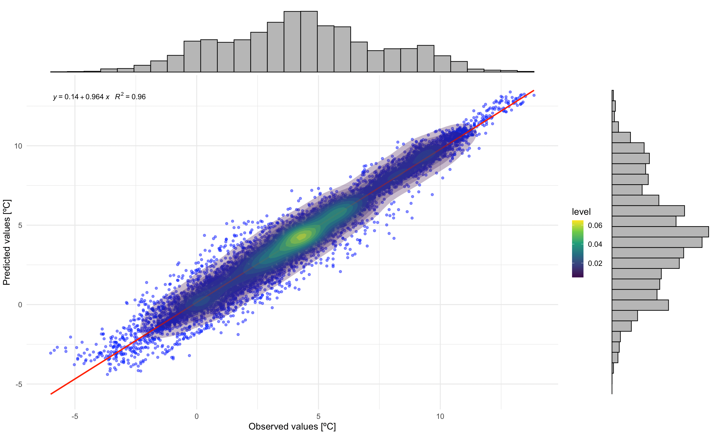
Correlation between observed and predicted temperatures. The regression equation and R² value indicate model performance. Marginal histograms show the distribution of both observed and predicted values.
Residual Analysis by LCZ Class
This plot examines residuals (observed - predicted) by LCZ class, helping identify systematic biases in different urban forms:
- Scatter points showing individual residuals
- Horizontal red line at zero (perfect prediction)
- Loess smoothing line (blue) showing trend
- Density contours indicating point concentration
# Residuals plot by LCZ class
p2 <- ggplot(df_eval, aes(x = observed, y = residual)) +
  geom_point(alpha = 0.3, color = "darkgreen", size = 1) +
  geom_hline(yintercept = 0, linetype = "dashed", color = "red", linewidth = 0.8) +
  geom_smooth(method = "loess", color = "blue", se = FALSE, linewidth = 1) +
  stat_density2d(aes(fill = after_stat(level)), geom = "polygon", alpha = 0.3) +
  scale_fill_viridis_c(option = "plasma", direction = -1, name = "Density") +
  facet_wrap(~ lcz, scales = "free", ncol = 3) +
  labs(
    title = "Residuals by LCZ Class",
    x = "Observed Temperature [°C]",
    y = "Residuals [°C]"
  ) +
  theme_minimal(base_size = 12) +
  theme(
    plot.title = element_text(size = 16, face = "bold", hjust = 0.5),
    axis.title = element_text(face = "bold"),
    strip.text = element_text(size = 12, face = "bold"),
    legend.position = "right",
    panel.grid.major = element_line(color = "gray90", linetype = "dotted"),
    panel.grid.minor = element_blank()
  )

# Print the plot
p2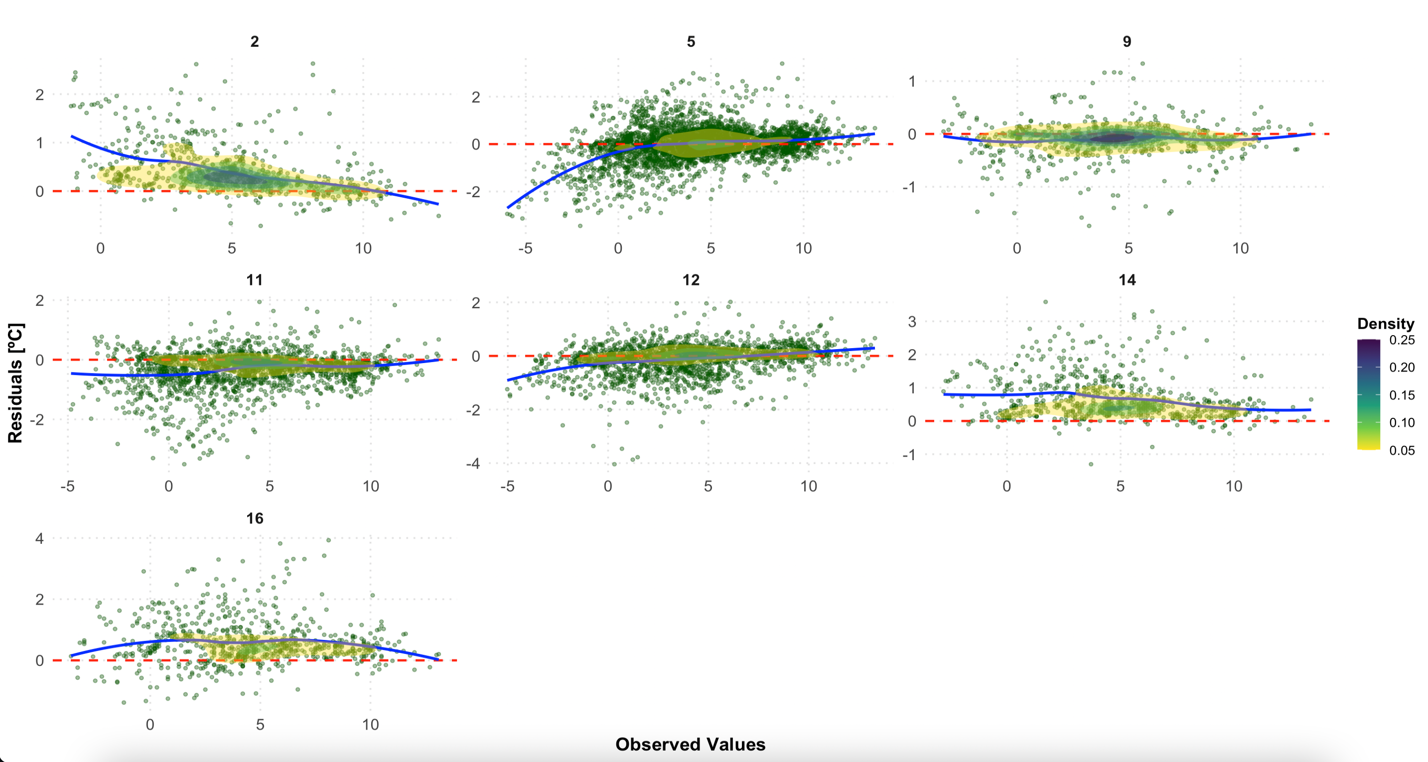
Residuals by LCZ class. A random scatter around zero (red line) indicates good model performance. Systematic patterns may reveal biases in specific LCZ types.
Interpreting the Results
What Good Performance Looks Like
- High R² value (> 0.8) indicates strong predictive power
- Low RMSE (< 1.5°C) suggests accurate temperature estimation
- Random residual pattern around zero (no systematic bias)
- Consistent performance across LCZ classes
Potential Issues and Solutions
| Issue | Possible Cause | Solution |
|---|---|---|
| High RMSE in specific LCZs | Sparse station coverage in that LCZ type | Add more monitoring stations |
| Systematic bias in residuals | Model assumptions not met | Try different variogram models |
| Poor performance in certain hours | Temporal variability not captured | Adjust temporal resolution |
| High uncertainty in peripheral areas | Edge effects in interpolation | Expand study area or use different boundaries |
Advanced Evaluation Options
Comparing Different Interpolation Methods
# Compare LCZ-based vs. conventional kriging
eval_lcz <- lcz_interp_eval(
  lcz_map, lcz_data, var = "airT", station_id = "station",
  year = 2020, month = 1, LOOCV = TRUE,
  sp.res = 500, tp.res = "hour",
  LCZinterp = TRUE   # LCZ-based interpolation
)

eval_conventional <- lcz_interp_eval(
  lcz_map, lcz_data, var = "airT", station_id = "station",
  year = 2020, month = 1, LOOCV = TRUE,
  sp.res = 500, tp.res = "hour",
  LCZinterp = FALSE  # Conventional kriging
)

# Compare RMSE between methods
rmse_comparison <- data.frame(
  Method = c("LCZ-based", "Conventional"),
  RMSE = c(sqrt(mean((eval_lcz$observed - eval_lcz$predicted)^2)),
           sqrt(mean((eval_conventional$observed - eval_conventional$predicted)^2)))
)
Temporal Patterns in Model Performance
# Calculate daily RMSE to see temporal patterns
daily_performance <- df_eval %>%
  mutate(date = as.Date(date)) %>%
  group_by(date, lcz) %>%
  summarise(
    daily_rmse = sqrt(mean((observed - predicted)^2)),
    .groups = "drop"
  )

# Visualize temporal variation
ggplot(daily_performance, aes(x = date, y = daily_rmse, color = lcz)) +
  geom_line(alpha = 0.7) +
  geom_smooth(method = "loess", se = FALSE, size = 1) +
  labs(
    title = "Daily RMSE Variation by LCZ Class",
    x = "Date (January 2020)",
    y = "RMSE [°C]",
    color = "LCZ Class"
  ) +
  theme_minimal()
Save Results
# Save the evaluation metrics to CSV
write.csv(df_eval_metrics,
          file = "berlin_interpolation_metrics_jan2020.csv",
          row.names = FALSE)

# Save the full evaluation data frame
write.csv(df_eval,
          file = "berlin_interpolation_evaluation_jan2020.csv",
          row.names = FALSE)

# Save plots
ggsave("correlation_plot.png", p1_with_marginals, width = 10, height = 8, dpi = 300)
ggsave("residuals_by_lcz.png", p2, width = 12, height = 10, dpi = 300)
Have feedback or suggestions?
Do you have an idea for improvement or did you spot a mistake? We’d love to hear from you! Click the button below to create a new issue (GitHub) and share your feedback or suggestions directly with us.
Open GitHub issue